Late last summer the wife and I took a trip to Washington D.C. where we visited a number of sites. The main objective of our trip, however, was the National Gallery of Art which was hosting an exhibition of paintings from the Venetian Renaissance. The exhibition centered upon the work of three artists: Giorgione, Giovanni Bellini, and Titian. The exhibition was my first major museum show in number of years… and certainly the first since the focus of my work had shifted to collage.
Already I was having second doubts. I was wondering how long I could keep on in the current direction. I was also wondering how long I could continue to deny my very real passion for drawing and for color. Color! Yes certainly color! Color was the central revelation of this museum experience. I wandered from room to room completely enthralled… rapt in the splendor of such brilliantly colored paintings as Giorgione’s Adoration of the Magi:

or his equally marvelous Three Philosophers:

Titian’s Noli me tangere

or the famous, Fête Champêtre:

or Giovanni Bellini’s exquisite Madonna and Saints (San Zaccari Altarpiece):

or the equally marvelous Feast of the Gods, which may have been begun by Giorgione and completed by both Titian and Bellini:

The color of these 500-year old masterpieces was stunning… like stained glass. I left the show hungering for such color… but not certain where to begin.
In spite of feeling more than inspired… perhaps the correct word would be “transfigured”… and knowing that I needed to change something… my initial response was to return to where I had left off… with an added bit of color. I began a series of collage paintings still focused upon geometric structures… but with far more use of color:

–Mephisto Waltz, 2007

–Tocatta and Fugue in Red
The resulting works were quite handsome, I believe, but I knew they did not go far enough… and they did not address the very real frustration I felt which might simply be explained as the repressed desire to once again DRAW! Finally I set out toward this end by beginning a series of small still life paintings drawn and painted from life. I had never been overly enamored of the still life as a genre, but I deeply admired some of the results others had achieved. Among the more recent examples I thought especially of Giorgio Morandi’s bottles:

and Avigdor Arikha’s simple paintings of everyday objects painted from observation in a single setting:

I had also become aware, by this time, of the number of artists who begun to participate in the exercise… the movement (?) that had become known as “A Painting a Day”. Working with a time limitation of a few hours and within the confines of a rather small scale (usually less than 12″ in any direction) a number of painters had challenged themselves to produce a painting almost every day. The resulting works were then posted to the internet and offered for sale at a more than reasonable price (often $100 or less). While many artists jumped on the bandwagon after the idea began to result in some real financial success for some (and certainly one must admire the motivation of artists promoting themselves and circumventing the stranglehold of the commercial gallery system), there were a number of painters who certainly showed some real ability. Duane Keiser, a professor in painting at the University of Richmond in Virginia is certainly one of the best… and most successful:

Duane Keiser, Blackberries 3×2.5″
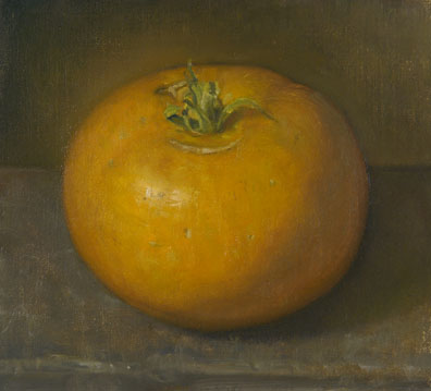
Duane Keiser, Lemon Boy Tomato

Duane Keiser, Milk Bottle and Sunbeam
(for more of Keiser’s work check out his website and blog: http://www.duanekeiser.com/index.htm )
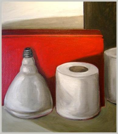
My initial return to painting from life focused upon a few simple objects: books, bottles, rolls of toilet paper… allowing me to concentrate upon the geometric structure of the painting as a whole… upon the sensitivity of the paint handling… and upon the color. Back several years ago or more when I had last been painting I had become attracted to the subtle variations of grays and earth-tones that one might find in a painting by Lucian Freud, Velazquez, or Morandi. Some of this remained in these newer paintings… but at the same time I began to utilize at least one brilliant color to offset this subtlety. In order to for this color to truly sing I also began to employ the best quality paints (something the small scale of these works allowed me to do) I utilized true cadmium red or yellow, real French Aquamarine… and found that these small paintings glowed in a manner far more powerful than one might imagine given their scale.

There were undoubtedly certain aspects of these paintings that I found quite successful. On the other hand there were aspects that I found were not heading in the direction that I wished for my art to go.
And then… within the past few week… I found myself struck by a number of events which, coincidental or not, led me to truly rethink what I was doing. Perhaps the initial impetus occurred when I found a charming new book at the book store on the work of Degas. Years ago Degas had been one of my gods, but I hadn’t really looked at him for years. Leafing through this book with an artist friend I could not help but nod in agreement with his estimation, “Degas could draw like a mother-fucker.” At almost the same time as this rediscovery, I was engaged in teaching my students how to utilize pastel. The resulting works were fabulous… and I found myself toying around a bit with the medium myself. Shortly thereafter, I unearthed a number of my old charcoal, terra-cotta, and pastel drawings which had been rolled up for over 15 years. As I unrolled them and taped them to the walls for better examination, the same artist friend who had been so astute (if not eloquent) in his judgment of Degas declared in a somewhat surprised tone that these were without a doubt the best things he had ever seen by me… certainly far more dramatic… powerful… moody… and yet sensitive, than any of my more recent paintings. I had to concur.

–Queen of the Night, 1991

–Footsie, 1991

–The Death of Marat, 1990
Almost immediately upon the heels of this latest realization I suddenly found that one of the on-line academic classes I had hoped to enroll in in order to renew my teaching license was already filled to capacity and had been closed. As a result I would need to take another class. The only class that I found would fill the requirements was an advanced drawing course. I had toyed with taking some drawing classes last summer, feeling that I could probably use brushing up on certain skills… especially in drawing from the figure and in perspective. Having worked abstractly for such a period of time I found that these abilities had atrophied… but I hadn’t really needed them. With the expansion of my school from grades k-5 to k-8 however, I now found myself needing to use some of these more advanced skills in drawing and painting. The enrollment in this course simply sealed things… I would return once more to an an love… to DRAWING!
****************************************************************************************

As I have begun a return to drawing in pastel it is perhaps not surprising that I have once again begun to explore what other artists over the course of history have made with this medium. Among the first drawings that truly attracted my attention as works of art in and of themselves, I must surely count the wondrous “studies” in sepia, terra-cotta, and sanguine made by such “ols masters” as Michelangelo, Raphael, and Rubens.

Michelangelo’s “study” for the Libyan Sibyl figure used in the Sistine Ceiling has long been one of the drawings I have held in deepest admiration. I can easily understand the curator of the Metropolitan Museum of Art who declared that in a case of fire this would be the one item he would seek to save. The drawing is simply exquisite… indeed, I would go so far as to suggest that it is a virtual school of how to draw. What could be learned about the art of drawing from this single study is quite remarkable.

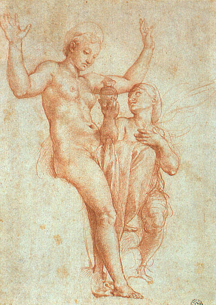
Leonardo Da Vinci’s, The Virgin and Child with Saint Anne and the infant Saint John the Baptist is perhaps no less spectacular. The drawing, rendered in black charcoal and white chalk on toned paper was in all probability intended as a “cartoon” or full-sized preparatory study for a painting. This intended painting never materialized, however, as the drawing shows no signs of having been transferred to the canvas or panel through the use of “pricking” or incising the outlines. Instead, the work was apparently preserved as a finished work of art in its own right… surprising for its time (and giving further example to the level of esteem to which Leonardo was afforded) in spite of the fact that it clearly exhibits passages that are unfinished. The drawing is striking in its mysterious and almost brooding atmosphere which is no less bewitching than the related painting of the Virgin of the Rocks:

Indeed… one can just as easily imagine this drawing when reading Rossetti’s famous sonnet, as the painting now housed in the Louvre:
Mother, is this the darkness of the end,
The Shadow of Death? and is that outer sea
Infinite imminent Eternity?
And does the death-pang by man’s seed sustained
In Time’s each instant cause thy face to bend
Its silent prayer upon the Son, while He
Blesses the dead with His hand silently
To His long day which hours no more offend?
Mother of grace, the pass is difficult,
Keen are these rocks, and the bewildered souls
Throng it like echoes, blindly shuddering through.
Thy name, O Lord, each spirit’s voice extols,
Whose peace abides in the dark avenue
Amid the bitterness of things occult.
-Dante Gabriel Rossetti
Many others among the “old masters” were no less proficient with chalk/terra-cotta/sangine/sepia etc… Raphael’s drawings are quite sensual:
… and surely Pontormo’s are no less so:

Tintoretto, on the other hand, conveys an electric muscularity and sense unbridled energy in his bold charcoal drawings:

Peter Paul Rubens, however, had the rare ability to convey both the energy of Tintoretto or Michelangelo and the sensuality of Raphael as can be see in his spectacular copy after one of the nudes from Michelangelo’s Sistine paintings:

Perhaps the most splendid of Ruben’s drawings, however, are those sensitive and loving portraits of his wives and children rendered in several different colored chalks:
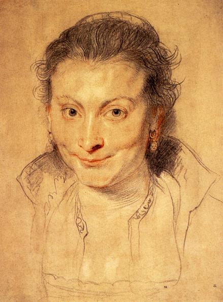
–Portrait of Isabella Brandt, the Artist’s First Wife

–Portrait of Helena Fourment, the Artist’s Second Wife
These drawings display the artist’s absolute mastery at rendering the human form and conveying an enchanting sense of personality through the most singular economy of means. Ruben’s work in chalk will provide a source of inspiration for virtually every artist of the next generation… just as his late paintings are virtually the starting point for the whole of Rococo painting.
Virtually all of the key artists of the Rococo era employed charcoal or chalk in their drawings. Boucher, Fragonard, and Watteau all made numerous studies of figures and faces utilizing two or three different colors of pastel:

-Francois Boucher- Reclining Nude

-Jean-Honore Fragonard- Studies of Women

-Jean-Antoine Watteau- Studies of a Young Girl
While most of these drawings may seem lightweight… even frivolous (like much of the Rococo) in comparison to what went before… the artists must be credited for the marvelous spontaneity of their work and their willingness to imagine that the leisurely activities of young lovers, children, the stroll in the park might provide a worthy subject matter for art. The Rococo artist will certainly stand as a source of inspiration for the later development of Impressionism… and especially for the works of Renoir, Bonnard, and Vuillard. Equally important, however, was the development during the age of the art of pastel as we know it… pastel “paintings” which employed the same variety of color and the same degree of “finish” as oil painting.
The “invention” of “pastel painting” is generally accredited to the Venetian artist, Rosalba Carreira. She became the first popular artist employing the medium innovating many of the techniques still utilized such as blending and rubbing the surface of the “painting” to create a soft, delicate feeling. Pastel paintings soon became quite popular… especially throughout France. Most of the leading painters of the era created a number of pastel “paintings” including Watteau, Boucher, and Fragonard:

-Jean-Honore Fragonard- Portrait de vieille femme
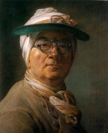
Among the leading artists of the day, the painter, Jean-Baptiste-Siméon Chardin may have been the most successful pastel “painter,” producing, among other things, a series of unreservedly honest self-portraits:


There were numerous other artist who mastered the medium. One of the finest was the German painter Anton Raphael Mengs who was also masterful at self-portraiture… both early and late in his career:


Two of the finest pastel artists of the age… and perhaps of all time… specialized in the medium over all others. Jean-Étienne Liotard was a Swiss artist known for his exquisite pastels (and his work as a painter of miniatures. Like Chardin and Mengs he seems to have been particularly drawn to the self-portrait… however his self portraits often have an exotic… and almost comic quality to them. The artist was known for his penchant for dressing in outlandish “Oriental” inspired garb… something he does not hide in his pastels:


As a result, Liotard, who was commonly referred to as the “Turkish Painter,” may have been one of the first important European artists to develop an passion for the the Middle-East… an attitude that would continue to serve as a source of inspiration for painters from Delacroix and Ingres, through Matisse, and even Paul Klee. In spite of his idiosyncratic habits, Liotard was a master capable of producing the most exquisite and sensitive of portraits in pastel. The Chocolate Girl is perhaps his most beloved work, taking pastel to a new level of subtlety, delicacy of color, and unsurpassed “realism”:


Virginia Wieringa said,
April 21, 2008 at 12:13 pm
This is an incredible art history tour!
I see your work being influenced by the sources but still very much your own! Bravo! I agree with your friend- those pastels are fabulous. The Queen of the Night is incredible!
(Tin cans are fun to draw in charcoal because of their unforgiving changing perspective elipses! I can see you excelling with them.)
Ranjan Kumar said,
February 14, 2009 at 9:45 am
The collection of paintings is really awsome. I saw such a wonderful collection first time ever.